Sites for creating scientific posters abound. Whether you want straightforward explanation or a sense of humor or have an eye for beauty, you will find a free place on the web for creating posters. Here are a few to get you started!
- Michael Alley — engineer — excellent straightforward explanations that include templates with fonts and sizes as well as examples
- Amy Replogle — molecular biologist — great workshop on creating posters with particularly good tutorial on using PowerPoint effectively to create posters
- Colin Purrington — evolutionary biologist + nature photographer — humor and science blended with excellent advice on everything from creating posters to avoiding plagiarism
- Zen Faulkes — neuro-behavioral-evo biologist — THE site for talking color, design, and the art of the scientific poster — a great place to spend a rainy afternoon
So what will we be adding to the conversation? Well, first, you just got a curated listed of really good sites to visit, all of which offer advice by scientists who preach what they practice. This is a big deal — too many places on the web offer advice because students are looking for it without much in the way of street cred. As you look for additional help with this task, filter by those who are actually researchers. Don’t feel too constrained by discipline — you’re seeking advice from those whose scientific mind includes a closet artist, and that combination is not limited by field.
Second, we’ll offer our version of this writing task, which is also a presenting task.
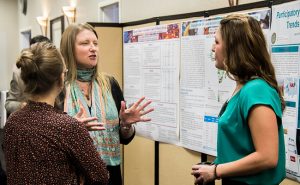
Posters are made for the eyes of an audience in motion
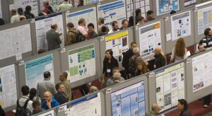 Frequently, you’ll see the advice: “the text on your poster should be readable in less than 10 minutes”. What?? In a poster session, dozens — even hundreds — of posters are displayed simultaneously to an audience who is moving, walking among the displays, scanning for topics or images that catch their attention. A poster session is part science fair, part art festival. NO ONE wants to stop and read for 10 minutes, or 5 minutes, or even a minute. The audience wants a message that is scannable, that helps them filter among the entries so they know where to spend time. They want to talk with you. Your job is to engage them.
Posters tell a short story
 Posters have limited real estate. You cannot tell the whole story of your research or include an entire paper. This limitation creates an opportunity to emphasize specific aspects of the research, from a major outcome to a big idea to a methodological twist. Any research project has multiple potential posters, so think creatively — how many tales does your research tell? Did you innovate a step in the method? How did that come about? Even if the change is too small for a publishable paper, it can make an excellent poster, and create an opportunity for you to talk about your project.
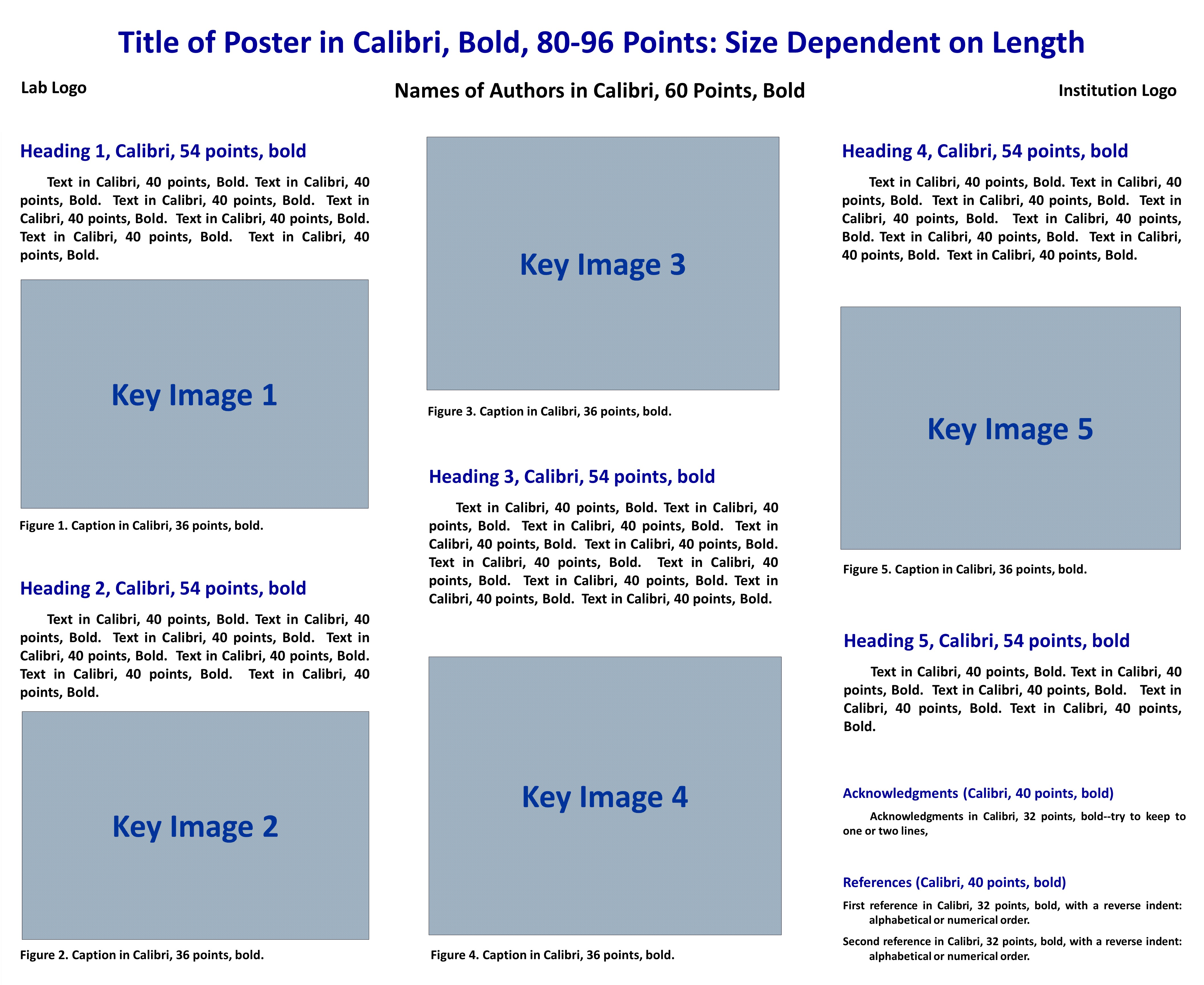
To communicate research as a whole, whittle down the IMRD to a few brief bullet points. The goal here is to capture the basic ideas, not the entire paper. You add details in your presentation and conversation. Keep in mind that the audience has the same basic needs as a reader: what happened? why should I care?
Introduction
Convey the motivation for the research — on a poster, this is easiest to sketch with a classic problem statement in the “A but B therefore C” form, where A and B are contradictory states leading naturally to your research question (RQ), which is C.
- A = “Living with diabetes requires continuous self-management”
- but = “However” (can use the word or not)
- B = “Adolescents and young adults struggle to keep up with blood glucose monitoring”
- therefore
- C = “Can a text messaging reminder system increase BG monitoring rates?”
Caveat: Some poster competitions emphasize the “lit review” section of a poster (a puzzling requirement given the limitations and opportunity of a poster). If you have to add a lit review to be competitive, then expand the problem statement to include supporting detail for each point, but do NOT write the whole introduction. Make the lit review highlight the motivation driving the paper. Remember to include citations (use a numbering citation style instead of an author/date style, if permitted). Here’s one way this could happen with the example above.
- A = # of young adults diagnosed with diabetes + diabetes requires self-management + negative outcomes if not managed correctly
- B = YAs struggle to self-manage in the face of growing autonomy + YAs own/use mobile devices + rates of ownership
- C = given the # of text msgs YAs exchange, can a text messaging reminder system increase BGM rates?
Method
Include only the major steps or only the most innovative portion. You do not need to include every preparatory detail! The audience can ask you about it or read the paper. If pictures are important, include them.
Results
Select the most significant outcome/s — the one you’d write in the first paragraph of the Discussion section. Use figures to illustrate, if possible. You may have different figures for the poster than for the paper! For example, tables are pretty horrible to look at — they are difficult to read, and rarely convey meaningful information to anyone at a glance. The Results should be the feature of the poster and should clearly answer the RQ.
Discussion
The Introduction answers “why was this research done”; the Discussion addresses “why does this research matter”. On the poster, you let the Results do the talking in terms of answering the RQ, so the Discussion does NOT need that information. Instead, let the Discussion focus on interpretation — what does it mean for the field? Are there applications? What should happen next?
Other Possible Text
- Abstract — unless required, don’t include it. If required, use a smaller font size. Very few will read the abstract, so don’t sacrifice precious real estate on it.
- References — if you cite papers, you must provide a References section. This is a credibility issue, even though few readers will actually check the sources. Use a small font size, and place in the lower right corner. Alternatively, sources could be included at the bottom of each section in which they are used, though that is not the norm.
- Acknowledgements — include if required, use a small font size, and find space in the lower right corner.
Posters have structure
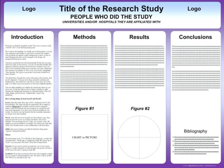
 Generally speaking, posters mirror print, with information flowing from left to right and top to bottom. The physical layout embeds the basic narrative of a science story: it begins on the left, has a middle part, and ends on the right. If you are new to poster design, then starting with a 3 panel or 4 panel layout is a good idea, and will help you organize information and images. If your research is especially text-dependent, then panels are a solid choice.
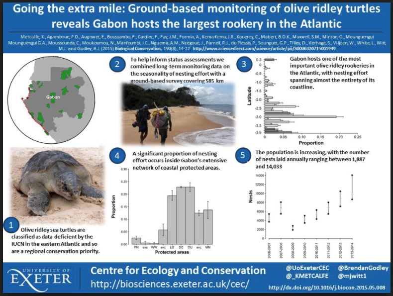
However, panel design can vary, particularly with regards to the proportion of the center. Centering the main figures or pictures with text on either side emphasizes outcomes and draws the audience in. You can even tell the entire story in mostly images while still retaining the panel design’s clear information structure.
Posters exploit visual messaging
Posters succeed on the strength of their visual impact. You need a color scheme that is pleasing to the eye, but does not overwhelm or distract. Avoid strongly contrasting colors — they fatigue the eye quickly and detract from the message. The most restful and pleasing color palettes feature blues, greens, and purples with red, orange, and yellow used sparingly (if they are used at all; conference posters don’t need pops of color). Black and white can also be very effective as a color scheme, especially if the images on the poster have color.
Images are important to posters — if your research does not produce graphs and figures, then consider images that are thematically related. For example, a linguistics research project on phonemic variation in Miami’s versions of Spanish doesn’t produce bar charts and line graphs, and the International Phonetic Alphabet isn’t a work of art. However, a student with this project took a picture of iconic south Florida vegetation, colored it with a pale green tint, and used it as the background with text in a deeper shade of green. It was a gorgeous poster, and drew the eye in, which gave her the opportunity to talk about her work. When using whole-poster background images, you will likely need to make it transparent in order not to interfere with readability. Be sure to look at the poster with the image before printing — I’ve seen images that were simply too busy, and no amount of transparency compensated for the competing lines. And I’ve seen posters where the idea was right, but the image was not…for instance, a photo of a dog carrying a stick in its mouth, which in the original photo looked delightful, but when blown up on a poster, the dog looked like a pixelated monster from a horror movie.
Posters include a presentation
Have you heard of the 3 Minute Thesis competition? Briefly, the goal is to present your research in 3 minutes to a mixed audience. Universities all over the world are now holding 3MT competitions because it’s such a great tool for training science communication. The model works very well as a starting place for posters, too. Broadly speaking, there are 2 kinds of questions you will get at a poster competition: big idea questions and specific detail questions. The “killer” question is the most general big idea question: “So, tell me about your research”. Can you explain your entire project to an audience that includes non-experts in 3 minutes? This is also an awesome “fishing for colleagues” question — someone who can talk research broadly and conversationally is a terrific asset.
A good answer to this general question starts with the motivation driving the research — what problem were you solving? Where did the problem come from? Motivation hooks a reader by giving them an unresolved issue; we like resolution, so when you then move to your RQ, your audience is happy that you’ll be answering the question. For this presentation, go lightly on methods — you just need the big, major moves, not more than a couple of sentences (15 – 30 seconds out loud). Then, elaborate on the Results and what the results mean. This tells the “story” of your research, and is cognitively pleasing to both expert and non-expert audiences.
Other big idea questions include: what would you do differently, what should happen next, what was your personal interest in this study, what are the real world applications…all of these questions ask you to think beyond the research itself to the larger contexts in which research matters or operates.
Specific detail questions are what you likely expect: all those nitty-gritty decisions that go into doing research. The audience wants more detail on method or deeper discussion of data points. They may challenge why you chose a particular instrument, statistic, tool, study site, material, or population. They may disagree with your interpretation. The key to answering specific detail questions is to be prepared — know thy research! If you worked in a lab and didn’t make all the key design decisions, ask whoever did about them or read the grant. Understand why a particular statistical test was selected. Know the limitations of your research. Be mentally prepared for the person who is interested in your work, but has a different approach. These kinds of conversations can get intense. If you find someone monopolizing your time, suggest a later meeting so you can talk in depth.
Poster sessions have a process
First, obviously, you create the poster. Decide on your content, then move to layout. I recommend sketching out by hand first — you have to make decisions about layout, and that’s usually faster with a pencil and paper. Then, move to a computer and duplicate the layout using textboxes. PowerPoint works better than Word for this, and moving boxes and images around a PowerPoint slide is much more fluid than on a Word doc.
After you print the poster, you may want to laminate it, especially if you’re traveling. Lamination is expensive, so if that step isn’t in the budget, invest in a waterproof poster tube. This will protect your investment!
The final step in poster session prep is to figure out a sharing strategy so that your audience can read your paper or get in touch with you. If you like handing out brochures, then on a single piece of paper, paste an image of your poster on one side; on the other, include an abstract, a link to the paper (if it’s ready), and your contact information.
A more modern (and more sustainable) method is to include a QR code on the poster that links to a site with an abstract, the paper, and your contact information. It’s easy to find free, effective QR code generators — here’s one to start with: QR Code Monkey
At the poster session, hang your poster in its designated spot, and prepare to hang out and answer questions. This is the fun part!